Opportunities and risks abound in the realm of trading cryptocurrencies. To navigate this dynamic landscape effectively, traders rely on various indicators that provide valuable insights into market trends, sentiment, and potential entry and exit points. These indicators serve as powerful tools that help traders make informed decisions and enhance their trading strategies.
In this comprehensive guide, we will explore a range of crypto trading indicators, their types, significance, and practical applications. Whether you’re a beginner or an experienced trader, understanding these indicators will give you an edge in the highly volatile and ever-changing crypto market.

Section 1: Moving Averages
Moving averages are fundamental indicators that help traders identify trends, smooth out price fluctuations, and gain insights into potential support and resistance levels. We will discuss different types of moving averages, including simple moving averages (SMA) and exponential moving averages (EMA). We will explore their calculations, interpret their crossovers, and examine how traders utilize them to identify trend reversals and determine optimal entry and exit points.
SMA is simply the mean, or average, of the stock price values – usually closing prices, over the specified number of periods.
Below is the formula for SMA:
SMA= [A1 + A2 +…+ An] / n
where:
An = the price of an asset at period n
n = the number of total periods
With an exponential moving average (EMA), the most recent data points are given more weight. Its calculation is more involved and is given below:
EMAToday=[[ValueToday ∗ ( Smoothing/(1 + n) )] + EMAYesterday ∗ [1− ( Smoothing/(1 + n) ) ]
where:
EMA=Exponential moving average
n = the number of total periods
Smoothing = Smoothing factor
The most common choice for smoothing factor is:
Smoothing = 2
The smoothing factor of 2 gives the most recent observation more weight. The EMA is more affected by more recent observations as the smoothing factor is raised.
Moving averages are often used to identify presence of a trend in a market. While there is no precise, all-encompassing description of what a trend is, there are numerous useful techniques for determining its presence. For instance, many people use the 200-day moving average of the closing price to describe the trend in the stock market. The direction of moving average is often used as reflection of the prevailing trend over a period.
Moving Average Crossover trading strategy is a type of directional strategy. It is based on use of technical analysis indicators – two moving averages of differing numbers of periods – to generate buy or sell orders using crossovers of those two moving averages.
When charting two moving averages of differing numbers of periods, say price moving averages for 10 and 20 periods denoted as MA(10) and MA(20), the average of shorter term (compared to the alternative moving average) – The MA(10) will move in the same direction as the longer-term moving average MA(20), but at a faster rate in relation to the other moving average. The two moving averages’ values may equal or cross at some times as a result of the distinct rates of change. These points are called the crossover points.
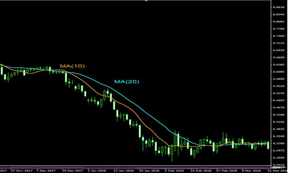
Buy or sell orders are generated using these crossovers as points of choice. When the shorter term moving average MA(10) moves above the MA(20), that is used as a Buy or (Long) signal. The logic behind it is that the shorter term moving average’s move above the longer term moving average is interpreted as a lagged indicator that the price is moving upward relative to the historical price. When the shorter term moving average crosses below the longer term moving average, a sell (or short) signal is produced.
Section 2: Relative Strength Index (RSI)
The Relative Strength Index (RSI) is a popular momentum oscillator for estimating the speed and variation of market movements. We will delve into the calculations and components of the RSI and discuss how traders interpret its readings. We will explore the concept of overbought and oversold conditions, as well as the significance of divergence. Through practical examples, we will demonstrate how traders can effectively utilize the RSI to identify potential trend reversals and generate profitable trading signals.
RSI indicator is used to measure the trading momentum of an asset gauged through recent changes in its price. It helps evaluate whether an asset has been overbought or oversold. Below is how you calculate it:
RSI = 100 – 100 / (1 + RS);
RS = Average of X periods up closes / Average of X periods down closes;
X = 14 usually, but it is entirely up to the trader how many to use.
The RSI value ranges between 0 and 100 and is displayed on the chart as a wave type-pattern – an oscillator.
Generally speaking, if the value is less than 30, the item has likely been oversold. On the other hand, if the value is greater than 70, the asset has likely been overbought.
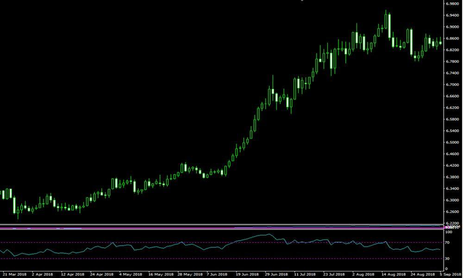
So two zones are formed. When the RSI is above 70 it is interpreted as a signal that too much of the asset is bought and the price will likely start declining as bears take control. It is understood as a signal to sell.
And when the RIS is below 30 – it is interpreted as a signal that too much of the asset is sold and the price will likely start advancing as bulls take control.
It is possible to forecast trend reversals using a variety of indicators and chart patterns. The Relative Strength Indicator is the most widely used indicator for predicting trend reversals: when the price crosses into overbought zone a decrease in price usually follows, while the crossing of the RSI into oversold zone usually precedes a price increase.
Section 3: Bollinger Bands
Bollinger Bands are widely used indicators that consist of a moving average and two standard deviation bands. They help traders identify periods of high or low volatility, potential price breakouts, and trend reversals. We will explain the construction of Bollinger Bands and discuss different strategies that traders employ, such as trading breakouts and identifying squeeze patterns. Through charts and examples, we will illustrate how traders can incorporate Bollinger Bands into their trading strategies to make informed decisions.
The Bollinger Bands utilize the idea of famous technical trader John Bollinger. They are often employed to identify trading signals as the price moves in a band around a moving average.
The indicator is formed by three lines as follows:
Middle Line = Simple Moving Average over 20 days (SMA)
Upper Band = SMA over 20 days + (Standard deviation of price over 20 days x 2)
Lower Band = SMA over 20 days – (Standard deviation of price over 20 days x 2)
Bollinger Bands indicators can help identify price trends. An uptrend is indicated if prices fluctuate in upper band above the middle line. Similarly, a downtrend is indicated if prices fluctuate in lower band below the middle line.
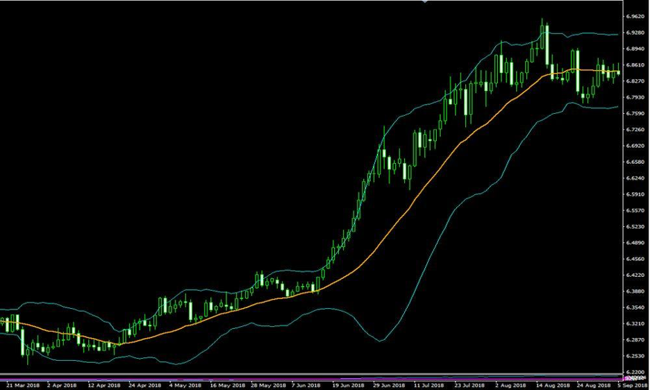
Trading signals are generated as the asset price crosses either of the bands or the middle line. When prices fluctuate between the upper band and the middle line it is interpreted as indication of an upward bias in price movement. And if the price then crosses below the middle line – it is interpreted as a warning of an impending trend reversal to the downside and therefore a sell signal.
When prices fluctuate between the lower band and the middle line it is interpreted as indication of a downward bias in price movement. And if the price then crosses above the middle line – it is interpreted as a warning of an impending trend reversal to the upside and therefore a buy signal.
Bollinger Channel breakout strategy is an example of a trend following strategy: every time the price exceeds plus or minus 2 standard deviations of its moving average, short or buy, respectively. Exit the position when the price reverts back to within 1 standard deviation of the moving average. For stocks 200-day moving average is usually used. Similarly, a long trade is entered on the open if the previous day’s close exceeded the top of the channel. If the closing is below the bottom band, a short trade is opened.
Section 4: Moving Average Convergence Divergence (MACD)
The Moving Average Convergence Divergence (MACD) is a versatile indicator that combines moving averages and oscillators. It provides insights into trend direction, momentum, and potential entry or exit points. We will explore the components of the MACD, including the MACD line, signal line, and histogram, and explain how traders interpret their crossovers and divergences. Additionally, we will discuss popular MACD trading strategies, such as MACD crossovers and hidden divergences, and provide practical examples to illustrate their application.
The MACD is another momentum indicator that highlights whether the short-term price momentum is moving in the same direction as the long-term price momentum. The MACD consists of four components: MACD line, signal line, zero line and histogram.
MACD line= 26 period EMA (Exponential Moving Average) – 12 period EMA (at closing prices)
Signal line = 9-period EMA
Histogram = MACD line – Signal line
Histograms provide simple and easy to use signals for trading.
When the histogram slopes upward it can be interpreted as a good time to buy. And when the MACD histogram slopes downward then it can be interpreted as a good time to sell.
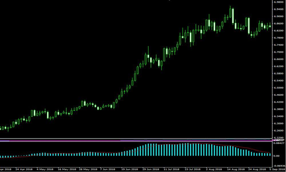
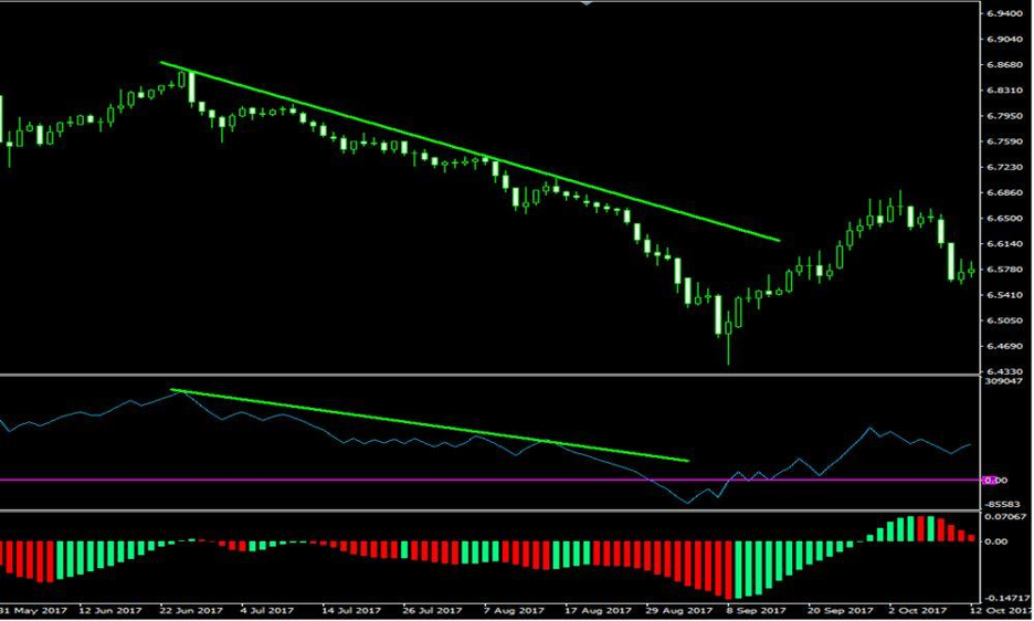
MACD can generate also signals of price divergence that can be used for trading. A bullish divergence occurs when the price reaches a lower low while the MACD reaches a higher low. This may be a sign of further weakness in downtrend – indicating a trend reversal is imminent and a long trade can be initiated.
Consequently, a bearish divergence is found when a price records a higher high, and the MACD records a lower high. This may be a sign of further weakness in uptrend – indicating a trend reversal is imminent and a short trade can be initiated.
Section 5: Fibonacci Retracement
Fibonacci retracement is a powerful tool based on the Fibonacci sequence that helps traders identify potential support and resistance levels during market retracements. We will explore the Fibonacci sequence and its application in trading. We will explain how traders use Fibonacci retracement levels to identify areas of potential price reversal or continuation. Through charts and examples, we will demonstrate how traders can incorporate Fibonacci retracement into their analysis to make informed trading decisions.
The support and resistance levels provided by these retracement levels might be used to set price goals.
First, a trend line between two extreme points is drawn to show the Fibonacci retracements. The trend line is then crossed by a set of six horizontal lines that are drawn at the Fibonacci levels of 0%, 23.6%, 38.2%, 50%, 61.8%, and 100%.
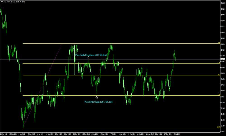
Possible areas of support or resistance are indicated by the percentage retracements, which are 23.6%, 38.2%, 50%, 61.8%, and 100%. A set of price objectives is produced by applying these percentages to the difference between the peak and low price for the chosen period.
Since Fibonacci retracement levels try to predict where price might be in the future, they are regarded as a type of technical indicator. When the market is trending, it operates best. When the market is heading upward, the idea is to go long (or purchase) on a pullback near a Fibonacci support level. Additionally, when the market is going DOWN, one should go short (or sell) on a retracement at a Fibonacci resistance level.
Section 6: Volume Analysis
Volume is a crucial indicator in crypto trading as it represents the number of trades executed during a given period. We will discuss how traders analyze volume to confirm price trends, identify potential reversals, and gauge market participation. We will explore volume-based indicators, such as Volume Weighted Average Price (VWAP) and On-Balance-Volume (OBV), and explain their significance in crypto trading. Through practical examples, we will demonstrate how volume analysis can be integrated into trading strategies to validate signals and enhance decision-making.
On Balance Volume (OBV) reflects buying and selling pressure. On Balance Volume is calculated by adding the day’s volume to a cumulative total when the security’s price closes up, and subtracting the day’s volume when the security’s price closes down.
Volume is a measurement indicating the number of units of a security that has been traded over a certain period of time. For example, in case of stocks, it’s the number of shares of a particular stock that was traded.
When the security closes higher than the previous close, all of the day’s volume is considered up-volume. When the security closes lower than the previous close, all of the day’s volume is considered down-volume.
OBV is a cumulative indicator that adds volume on up days and subtracts volume on down days. The actual value of the OBV is unimportant – its direction and changes in direction are used to infer conclusions about market state.
Below is how the OBV is calculated.
In case today’s close is greater than yesterday’s close:
OBV = Yesterday’s OBV + Today’s Volume
In case today’s close is less than yesterday’s close:
OBV = Yesterday’s OBV – Today’s Volume
In case today’s close is equal to yesterday’s close:
OBV = Yesterday’s OBV
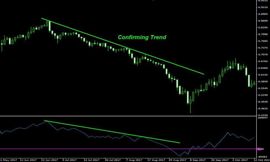
Trend Confirmation by OBV
OBV indicator is used to confirm trend presence as well as to predict trend reversals.
Trend confirmation using OBV is straightforward: when both the asset price and OBV are making higher peaks and higher troughs, the upward trend is likely to continue. And when both the asset price and OBV are making lower peaks and lower troughs, the downward trend is likely to continue.
Trend Reversal Predictions by OBV
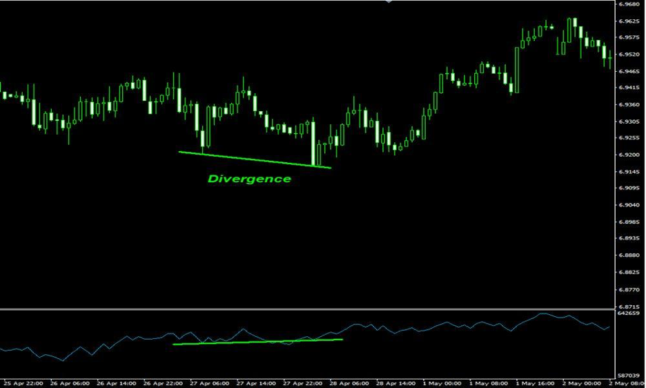
The OBV can also act before the price, indicating in which direction a price breakout could occur by diverging from price action.
When the price continues to make higher peaks and OBV fails to make higher peaks, the upward trend is likely to stall or fail. This is called a bearish divergence.
When the price continues to make lower troughs and OBV fails to make lower troughs, the downward trend is likely to stall or fail. This is called a bullish divergence.
The plot below displays a case of bullish divergence for OBV.
Trading strategies to take advantage of divergence occurrences are simple. If the trend is down and the OBV is showing a bullish divergence, a long position can be opened when the price breaks above its current trendline. A stop-loss can be placed below the most recent swing.
If the trend is up and the OBV is forming a bearish divergence, a short position can be taken when the price breaks below its current trendline. A stop-loss can be placed above the most recent swing,
VWAP Indicator
Volume-weighted average price (VWAP) is a widely used benchmark designed to reflect the average asset price where the asset sales prices are weighted by percentages of total sales volume (for the day) at that prices. Thus, the calculation uses intraday data only.
VWAP helps traders evaluate the current price of an asset and determine whether it is relatively overpriced or underpriced compared to the volume-weighted average price for the day.
One volume-weighted average price strategy then is to go long only when the price is below the VWAP and go short when the price is above VWAP. According to the theory, buyers who beat benchmarks are more likely to build support when the price is below VWAP than when it is above it, and similarly, buyers who beat benchmarks are more likely to build resistance when the price is above VWAP than when it is below it.
Section 8: Awesome Oscillator
Let’s move on to what is Awesome Oscillator and how to calculate it. The Awesome Oscillator indicator compares the most recent five bars on a candlestick chart to the most recent 34 bars. The difference between the simple moving average (SMA) of the median prices across these two timeframes is then used to compute the value. The following is the amazing oscillator formula:
Median price = (High price of a session + low price of a session) ÷ 2
5 period simple moving average (median price) – 34 period simple moving average (median price) is the Awesome Oscillator.
Below is an example of Awesome Oscillator indicator chart.
The Awesome Oscillator is a versatile technical indicator that can also be used effectively in crypto trading. Here is how to use the Awesome Oscillator for crypto trading:
1. Identifying Trend Reversals: The Awesome Oscillator helps traders identify potential trend reversals in the crypto market. When the histogram changes from positive (green) to negative (red), it suggests a possible shift in market sentiment. This can be used as a signal to consider exiting long positions or even entering short positions.
2. Confirming Price Breakouts: Crypto traders often look for price breakouts as opportunities to enter trades. The Awesome Oscillator can be used to confirm breakouts by analyzing the histogram. When the histogram bars turn green and start increasing in size, it indicates a potential bullish breakout. Conversely, if the histogram bars turn red and increase in size, it suggests a potential bearish breakout.
3. Divergence Trading: Divergence occurs when the price of a cryptocurrency and the Awesome Oscillator show contrasting movements. Bullish divergence is observed when the price makes lower lows, but the oscillator forms higher lows. This indicates a possible trend reversal to the upside. Conversely, bearish divergence occurs when the price makes higher highs, but the oscillator forms lower highs, signaling a potential trend reversal to the downside.
4. Trading Saucer Signals: The Awesome Oscillator can also provide saucer signals, which are considered bullish or bearish reversal patterns. A bullish saucer signal occurs when the histogram transitions from negative (red) to positive (green), forming a series of three consecutive green bars. This suggests a potential bullish trend. Similarly, a bearish saucer signal occurs when the histogram transitions from positive (green) to negative (red), indicating a possible bearish trend.
5. Setting Stop Loss and Take Profit Levels: The Awesome Oscillator can be used to set stop-loss and take-profit levels. For example, when the histogram starts to decline after a bullish trend, it could be an indication of a potential trend reversal. Traders can set their stop-loss orders below the recent swing lows or use the decreasing histogram as a signal to take profits on their long positions.
Remember, it is crucial to combine the insights from the Awesome Oscillator with other technical analysis tools and risk management strategies to make well-informed trading decisions. Additionally, practice and backtesting on historical data can help validate the effectiveness of using the Awesome Oscillator in your crypto trading strategy.
Section 8: Ichimoku Cloud
The Ichimoku Cloud is a comprehensive indicator that provides insights into trend direction, support and resistance levels, and potential trading signals. We will break down the components of the Ichimoku Cloud, including the Kumo (cloud), Tenkan-sen (conversion line), and Kijun-sen (base line). We will explore how traders utilize the Ichimoku Cloud to identify trends, confirm potential entry or exit points, and set stop-loss and take-profit levels. Through real-world examples, we will illustrate the practical application of the Ichimoku Cloud in crypto trading.
Ichimoku Cloud indicator, also known as Ichimoku Kinko Hyo was developed in 1968 by Tokyo columnist Goichi Hosoda.
Ichimoku Cloud indicator is formed by five moving averages as follows:
Tenkan-Sen (Conversion line, blue) = (9-period High + 9-period Low)/2
Kijun-Sen (Base line, red) = (26-period High + 26-period Low)/2
Senkou A (Leading span A, green boundary of the cloud) = (Conversion Line + Base Line)/2
Senkou B (Leading span B, red boundary of the cloud) = (52-period High + 52-period Low)/2
Chikou Span (Lagging span, green) = Close price plotted 26 periods in the past
Kumo (Cloud) is composed of the area between Senkou A and Senkou B. When the Leading Span A is higher than the Leading Span B, a green Ichimoku Cloud is generated on the plot, and similarly, a red cloud forms when the Leading Span B is higher than the Leading Span A.
Price movement relative to the Ichimoku Cloud and line crossovers generate various Buy/Sell signals as well as indicates trend persistence and corrections.
Strong Buy/Sell signals occurring above the Ichimoku Cloud:
Conversion line crossing Base line up below is a signal to buy
Conversion line crossing Base line from above is a signal to sell
Less reliable Buy/Sell signals occurring within the Ichimoku Cloud:
Conversion line crossing Base line from below is a signal to buy
Conversion line crossing Base line from above is a signal to sell
Determining the trend persistence and corrections:
Price staying above the cloud indicates an uptrend
Price moving below the cloud indicates a downtrend
Price moving sideways while remaining within the cloud indicates a sideways trend
The uptrend is getting stronger as Senkou A rises and crosses over Senkou B.
Senkou A is declining, and the downturn is gaining momentum below Senkou B.
A correction during an uptrend is indicated by a cloud shifting from green to red.
Cloud turning from red to green indicates a correction during a downtrend
Goichi Hosada used the (9, 26, 52) setting for periods as these periods gave best results. Back in the day, the Japanese business schedule included Saturdays. The number nine represented one and a half weeks, and the numbers 26 and 52 represented one and two months, respectively.
Some crypto traders adjust the Ichimoku setting to reflect the 24/7 operation of cryptocurrency markets. The settings, therefore, are changed from (9, 26, 52) to (10, 30,60). Additionally, some traders change the parameters to (20, 60, 120) in an effort to reduce erroneous signals.
Most traders use Ichimoku Cloud on daily timeframes. When it is used on smaller time frames, the Ichimoku Cloud may not account for larger trends.
Ichimoku indicator is often combined with other technical analysis tools and methods to get additional confirmation and improve signal reliability.
Conclusion:
Crypto trading indicators play a vital role in analyzing price movements, identifying trends, and making informed trading decisions. Understanding the different types of indicators, their calculations, and practical applications empowers traders to develop effective trading strategies and navigate the complex world of cryptocurrency trading. However, it is essential to remember that indicators are not infallible and should be used in conjunction with other analysis tools and risk management techniques. Continuous learning, practice, and adaptability are key to mastering the art of utilizing crypto trading indicators successfully. By incorporating these indicators into your trading arsenal, you can gain a competitive edge and improve your chances of success in the dynamic and exciting world of crypto trading.